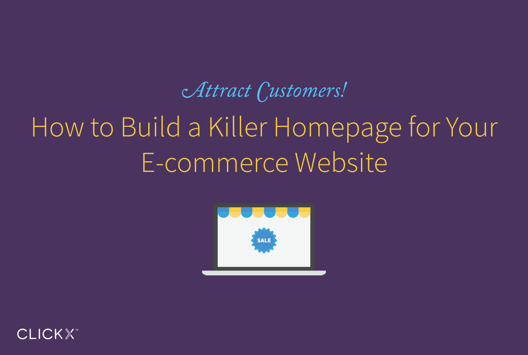
According to, e-commerce is on the rise. While retail sales were up only four percent in 2014, online retail sales jumped by nearly 16 percent. If you’re creating an e-commerce website, the homepage is where it all begins. On the homepage of an e-commerce website is, buyers will decide whether or not to start browsing, and it is where they will make snap judgements about the security and appeal of the business as a whole. In order to attract customers, help shoppers feel financially secure sharing their payment information and make it easy to find the items consumers need, your homepage should be topnotch. Kissmetrics proved that the average first-time visitor to an e-commerce website spends just 2 minutes and 31 seconds on the site before leaving. Work to extend that time, and encourage shopping, by learning what makes a killer homepage for your e-commerce website.
Keep the Search Field Visible
One of the biggest mistakes possible when building a homepage for an e-commerce website is forgetting to include a search field. Even if you do remember to include a search field, make sure that it is easy to spot and easy to use. Traditionally, a search function is located either at the top of the home page or on the right hand side, so choosing to put a search field in either location is a smart move that will feel instinctual to users. As many as 82 percent of e-commerce websites offer autocomplete suggestions for the search field (Smashing Magazine), but users often don’t find that to be beneficial. Rather than investing in auto-complete functionality, focus on a clean and efficient search function easily visible from the homepage.
Create an Easy-to-navigate Homepage
Website navigation is a major issue of discussion in the e-commerce world. Of course, it should go without saying that your homepage should offer some form of navigational tool that can help users find what they are looking for. However, exactly what that navigation should look like is still up for debate. Ideally, you should have a bar near the top of the homepage that offers a few major categories to users. These could include things like a history of the website, a contact information page and a pull-down menu. That menu can include a breakdown of the many products or services available on your website. While offering a wide variety of categories is helpful, offering too many can be distracting. Ultimately, the navigational specificity you choose depends on your industry and the number of products you offer. Whatever you choose, make sure the layout is easy to understand and that consumers new to the homepage can easily click and find what they are looking for.
Include a Cart Icon

One of the biggest trends in e-commerce website design, at least according to Practical E-commerce, is the use of a common user interface. Although there is nothing wrong with wanting your website to stand out from the crowd, the reality is that many shoppers feel more comfortable using an interface they are already familiar with. One of the integral elements of a familiar user interface is a cart icon. This tiny picture of a shopping cart makes it clear to shoppers where you go to check out and purchase items from the website. Putting this cart icon at the top of the homepage helps shoppers know where to look, and it also reminds them of past trips to the page that might not have been completed. Turning repeat visitors into first-time buyers in a major objective in e-commerce, and a cart that stores items consumers were recently interested in can be a big step in achieving that goal.
Advertise Specials, Sales, and New Products Seamlessly
It is natural for e-commerce website owners and managers to want to showcase upcoming sales, new collections and any other time-sensitive elements of their business. One of the best ways to accomplish that is to create a picture header that is visible right on the homepage of your website. Keep text to a minimum, and fit it within the header on top of the featured photograph. This could be a set of three photos that change every few seconds, allowing you to promote more than one thing at a time. It could also be a still picture that you change every few days or weeks as needed. If you decide to advertise certain items or events through pictures on your homepage, make sure that they can be clicked and are linked to the right page. For instance, if a picture shows a new clothing collection available on your website, ensure that someone who clicks on the photo is taken directly to the page where the various pieces of the collection can be purchased. Finally, never let featured content on your homepage become out of date. Update the homepage as needed so that nothing is outdated or no longer relevant to shoppers (Digital Marketing Pro).
[Tweet “Learn how to create a killer homepage for your #website! http://bit.ly/build-a-killer-homepage via @clickxio”]
Don’t Be Afraid of Negative Space
One of the biggest mistakes you can make as you put together a killer homepage for your e-commerce website is including too much on that single page. Instead of cramming all kinds of specials, products, categories and photos on the homepage, make sure there is plenty of negative space. In design lingo, negative space means unused space somewhere on the page. Negative space separates key items and concepts from each other, helping users to see and understand what you have to offer (Designmodo). From an aesthetic perspective, including negative space on the homepage makes your website look hip and trendy. When it doubt about adding more to the homepage, hold back. While too much negative space can still often look intentional and on-trend, a cluttered homepage can make your business look old-fashioned and out of touch.
Keep Your Brand Front and Center
When building an e-commerce website, it often makes sense to stick to at least a basic formula for success in terms of layout, icons and navigation. However, what you don’t want to lose is your brand identity, particularly on the homepage. Make sure that your website name is prominently displayed in a prime position at the top of the page. If the name is less recognizable, don’t be afraid to include it in several spots throughout the homepage to maximize brand awareness among website users. Keep a cohesive voice and picture style throughout the homepage as a way to create a brand identity and strong image for those who might be experiencing your business for the first time.
Every 30 seconds, e-commerce generates more than $1.2 million in profits (Adweek). Lest you think that’s all going to big players like Amazon, keep in mind that there are more than 110,000 e-commerce companies bringing in more than $1 million each year in revenue (RJMetrics). If you want your e-commerce business to be one of these profitable websites, use these tips to create a killer homepage that will get you noticed and be attractive to consumers from around the world.