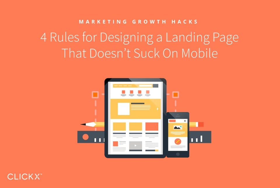
Mobile users are taking over the internet! Your regular website may be responsive, but have you checked whether your landing pages perform well on mobile devices? If not, you could be losing potential customers due to poor usability.
There are a few simple ways to improve the mobile usability of landing pages, none of which take a lot of time to implement. Moreover, by improving the mobile user experience, these strategies will hopefully help to boost conversions. It’s a no-brainer to get started on this right now!
In this article, we’ll show you four basic rules to follow when designing a mobile-friendly landing page. Let’s get started!
Key Takeaways
- Mobile devices account for most digital media growth.
- Mobile-friendliness is a ranking factor for mobile search results.
- Your landing page should load quickly and be easy to scan.
- Interactive elements should be easy to click and finger size should be considered in their design.
Why Landing Pages Should Be Designed for Mobile
Mobile usage already accounts for 65% of digital media time, and that data shows it is the primary driver for continued growth in the industry. That means, more and more, your customers are likely to be on mobile. You’ll need to be ready for them by offering a great user experience that outshines the competition.
[Tweet “Mobile-friendliness impacts your rankings and prepares your business for future growth.”]
Of course, you should always remember that Google has a history of rewarding great user experience. Mobile friendliness is a ranking factor in mobile search. If your landing pages aren’t mobile friendly, they may not be ranking as high as they could be.
4 Rules for Creating Mobile-Friendly Landing Pages
Before proceeding, we’ll assume you are already at least familiar with responsive design and that your current website is responsive. If you haven’t made the switch yet, we recommend you get started on that right away!
Rule 1: Don’t Load Large Media Files
Not everyone has fast, unlimited data on their phones—and it’s impossible to always be on Wi-Fi. Large media files, such as some images and videos, can take a long time to load, creating a poor user experience. Additionally, users on limited data plans might exit as soon as they realize you have a media-heavy site, in order to save their data allowance.
It’s also worth remembering that mobile devices have limited screen space. Large media files take up a lot of that precious screen space! You should only show media that is crucial to your message. For example, the image area of this homepage might be better used as a text area that briefly describes what the company does:

You can reduce the size of media files (or remove them) a few different ways, depending on the situation:
- For regular images, using the srcset feature in HTML allows you to load smaller versions on small devices. If you use WordPress, it already does this for you by default!
- To hide certain images only on mobile devices, you can use responsive CSS media queries.
- Avoid setting videos to play automatically as this forces them to load when someone opens the page. Instead, let the user decide if and when they want to play them.
Of course, media isn’t the only element that can take up a large amount of space. Let’s talk about one of the first things users will see—the headline.
Rule 2: Shorten Your Headlines
Lengthy headlines occupy a lot of space and take more time to read. Remember, mobile device users are often in a rush and have limited screen space. You don’t want to make them work any harder than necessary to find what they need!
To help them out, your headlines should be short and to the point, like the one in this example:

To optimize headlines for mobile, you could start by simply making it a rule of thumb to use shorter headlines in general, for both mobile and desktop pages.
However, if you prefer longer headlines for desktop, you can create device-dependent titles using tools like the Divi Builder. This WordPress page builder enables you to specify different headlines for various devices.
Rule 3: Create Copy That’s Easy to Scan
We’ve already addressed how to speed up the mobile experience by reducing media load times and shortening headlines. The next step is to optimize the amount of time it takes to find information on the rest of the page.
It is a long-understood fact that web (and device) users generally scan content instead of reading it. Therefore, it makes sense to ensure your copy is easy to scan, such as by using bold subheadings and short blocks of text:
Here are some simple formatting tips you can use to make your landing page a quick read:
- Use header tags to identify unique sections.
- Organize related information in lists.
- Use white space to break up large blocks of text.
By now, your landing page should be set up for the user to find important information quickly. Now you need to worry about what happens once they find what they’re looking for, like a telephone number to call.
Rule 4: Make Telephone Numbers Clickable
When someone is browsing a website on their phone, they expect to be able to click phone numbers and make a call. Google has been training them to do this with mobile ads since 2010!
Otherwise, they have to memorize the number, make a note of it, or copy and paste it into their calling app. A clickable number link, a Call button, or a telephone icon such as in the example below can make a big difference to the user experience.
Adding telephone links is similar to adding email links and can be done by simply inserting a line of code. Alternatively, if you’re a WordPress user, you can use a plugin such as Call Now Button.
Of course, having a clickable number is one thing, but making sure it’s easy to use for everyone is another. That’s where our bonus rule comes in!
Bonus: Ensure Buttons are Easy to Press
With so many mobile devices using touchscreen technology, people are typically using their fingers (and thumbs) to click links and buttons. If the design of your landing page makes those too small, it is difficult to accurately click them. By contrast, it would be difficult to miss the full width Tap to Call button on this page:

Here are a few guidelines you can follow to ensure your buttons are readily clicked by mobile users:
- Aim for at least 44px wide for main buttons and links.
- In general, buttons should be in the 45-57px range.
- Test how easy it is to click links and buttons on your own mobile device.
By now, your landing page should not only load quickly, but be readily scannable and easy to take action on.
Conclusion
As you can see, optimizing a landing page for mobile isn’t all that complicated. You should focus on creating fast-loading, scannable pages with easy-to-click buttons. By doing so, you’ll improve the user experience and hopefully boost conversions.
To review, the five rules we laid out in this post are:
- Don’t load large media files.
- Shorten your headlines.
- Create copy that’s easy to scan.
- Make telephone numbers clickable.
- Ensure buttons are easy to press.
What else do you want to know about creating a better experience for mobile visitors? Let us know your questions in the comments section below!