People spend a significant amount of time browsing the internet on mobile devices—so much so it accounts for 65% of all digital media time. That’s a lot! What’s more, mobile surfers are less patient and more particular about their browsing expectations than desktop users. Simply put, if you aren’t focusing on mobile users, you may be missing out on a rapidly growing opportunity for increasing traffic and profits.
It’s clear, therefore, that a mobile marketing plan is vital for your business’ future. However, without the right fundamentals in place, even the most spectacular campaign will struggle to keep the attention of picky mobile users.
In this post, we’ll teach you three essential elements that can attract and retain the mobile traffic you’re looking for, and we’ll teach you how to implement them too. Let’s get cracking!
Key Takeaways
- Mobile users are fussier than regular website visitors, and typically seek out local content.
- A quality responsive design lays the foundation for a happy user experience.
- Pop ups and other poor design choices can ruin the user’s experience without a data-backed reason.
1. A Wealth of Local Content
For this first element, consider your own daily experiences using a mobile phone. You may find that you’ll search the internet constantly throughout the day, no matter where you are. In fact, you may not even realize how often you look up information, it’s now so second nature. Given this, it’s clear what mobile users primarily want: action-oriented, local content.
[Tweet “Mobile users are often looking for action-oriented, local content.”]
To break it down, action-oriented means there’s an intent for the person to do something: for example, go to a store, buy an item, get directions, or make a phone call. Ultimately, if you’ve carried out a search, it’s a safe bet to assume someone else has too.
In addition, you’ll want your content to be specific to your local area—this could be the immediate neighborhood, city, or state depending on the topic. It means that content will always be relevant to the physical search location.
Putting this kind of content on your site ensures that mobile users are more likely to find it in search results—it’s basic content marketing after all—and they’re also more likely to find what they’re looking for once they’re on your site.
How to Produce Local Content
Here is our basic approach to creating local content:
- Identify your local target audience.
- Analyze your current local content, if you have any.
- Combine your broader content marketing strategy with local topics.
- Track your success and adjust your strategy accordingly.
As for specific strategies, there are plenty available, but in the past we’ve touched on targeting nearby neighborhoods and getting your customers involved in the creative process. They’re highly recommended as good starting points for your own local content strategy.
2. High-Quality Responsive Design
Responsive design simply provides a better user experience for any device size. This is accomplished by using the same underlying website code, but making some under the hood adjustments depending on the device’s size.
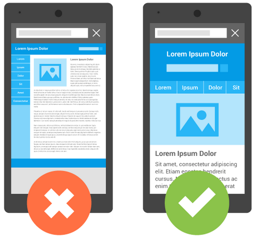
Making your website responsive is simply a no-brainer.
It’s true that there are several valid ways to present mobile websites, but responsive design is our recommendation. Need a second opinion? Try Google’s official documentation for mobile-friendliness—they’re not secretive about preferring responsive design over other mobile options.
How to Get Mobile Ready
Nowadays, responsive design has been adapted to the point you’ll only need to follow two simple steps:
- Choose a responsive theme.
- Optimize your site for speed to avoid any extra bloat on mobile.
It’s so easy, there’s really no excuse to forgo implementing this element.
3. An Exceptional User Experience
User Experience (UX) is a subjective topic. It has to do with the emotions and attitudes of your website’s visitors in relation to your website, more than any hard and fast design rules. It’s influenced by utility, ease of use, and efficiency.
The foundation of good UX is responsive design. However, this isn’t where it ends. UX is the measure of how well your website performs, and what happens while visitors spend time on your site. This includes the use of pop-up (or ‘interstitial’) ads.
Simply put, Google is not a fan of pop-ups on mobile sites because they consider them detrimental to user experience. They often annoy desktop users, but they’re even worse for mobile browsers. There’s also evidence pointing to pop-ups cultivating a lot of impressions while lacking engagements, and potentially ruining your credibility by prioritizing poorly designed ads over usability.
How to Create a Positive User Experience
There are two major elements to enable good usability on your site, beyond basic responsive design:
- Firstly, restrict the usage of pop-ups on mobile, and the way to do this will vary depending on how you implement them. If your ad provider doesn’t enable mobile detection, you may need to remove them completely.
- Next, make sure your links and buttons are easy to click. Buttons should be large enough for any sized fingers, and the JavaScript triggered by your links or buttons should also be mobile-friendly.
If you’d like to delve into UX design further, here are some best practices to get you started.
Bonus: AMP Compatibility for Mobile Search Results
Google’s Accelerated Mobile Pages (Google AMP) is a set of coding standards implemented primarily by Google to help dramatically increase the loading time for pages served to mobile devices. Other developers have also created their own versions, including Facebook Instant Articles and Apple News. However, Google AMP is open-source—so it’s accessible to everyone—and the pages can be accessed across multiple platforms.
While the direct SEO influence of Google AMP on a website is unclear, it stands a good chance of reducing bounce rates by offering fast loading times and a positive mobile experience. ‘Pogo-Sticking’ is a search ranking factor, so this is important.
There are a few other goodies that come with implementing Google AMP:
- You can also rank in Google’s AMP carousel without further effort.
- You get a lightning bolt icon displayed in mobile search results—a powerful indicator of a good UX.

How to Install AMP on WordPress
Google have made it simple for anyone to install AMP, especially if you’re using WordPress:
- Firstly, go ahead and install the AMP plugin—the process is fairly straightforward.
- If you use Yoast SEO, you’ll want to install the Glue for Yoast SEO & AMP plugin.
- Finally, be sure to test the final results with Google AMPs validator to ensure it’s all working properly.
Conclusion
When focusing on mobile internet users, losing out on the incredible traffic opportunity by ignoring basic optimization is a real misstep. Given the high numbers of people now using their devices to surf the web, leaving money on the table by not catering to them could be considered business suicide.
In this piece, we’ve covered a total of four key elements to help you avoid traffic-killing mobile blunders. As for implementing them, let’s recap what you’ll need to do:
- Publish lots of local content.
- Be mobile ready with responsive design.
- Create a positive website user experience.
- Install AMP for increased compatibility in search results.
Do you have any mobile website optimization tips to share with our readers? Let us know in the comments section below!