It’s hardly news to you that that many of your website visitors are viewing your site on a mobile device since nearly everyone these days has a smartphone, a tablet, or both.
But do you know what your users see when they view your site on those devices? In a recent survey, 46% of mobile users reported having problems viewing non-responsive websites.
Recently, our CEO revealed that mobile ad retargeting may be causing you to lose new business. Not giving responsive design the attention it deserves could also be costing you. In this article I will share what responsive design is, and why it is so important for your business.

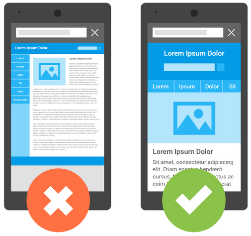
What Is Responsive Web Design?
Responsive web design is an approach to building websites that takes into account all the different devices used to access the web. With PCs, smartphones, tablets and now even watches, web users could be viewing your content on any number of devices, each with its own uniquely sized screen.
Among designers, responsive design has become the answer to the question of how to handle so many devices.
Responsive sites tend to do the following:
- Expand or contract fluidly to fit the size of the user’s screen.
- Use relative size units rather than exact pixel dimensions.
- Rearrange content layouts automatically for taller mobile screens.
- Resize text and link spacing to work better on small touchscreens.
Designers use responsive design because it is the best available solution to a relatively new problem.
Ignoring Mobile Users Will Cause You to Lose Business
You may be wondering whether you should worry about responsive design if you already have an existing website. The answer is an emphatic “Yes!”
According to a report from GlobalWebIndex, 80% of Internet users own a smartphone, and nearly half of users also own a tablet. While 91% of Internet users own a PC or laptop, GWI thinks 2015 may be the year smartphone users catch up. This means that more customers will be arriving at your site via a mobile device.
If we take a look at this study conducted by Google (published in 2013 in collaboration with Nielsen), there are a few highly important discoveries about consumer’s opinions and purchasing behaviors with mobile-friendly websites:
- 93% of people use their mobile devices to complete a purchase of a product or service.
- More than half of consumers want to make a purchase within an hour of researching on their mobile device.
- Consumers spend 15+ hours a week researching on their mobile devices, and average 6 visits to mobile websites before making a purchase.
But that’s not all. In late April, Google activated their mobile-friendly update, which boosts the rankings of mobile-friendly pages in search results. This means only one thing in the long term: if users access your site via mobile searches, you will see fewer visitors and customers if your site is not optimized for phones and tablets.
Google’s update boosts mobile search rankings for responsive websites that are usable across mobile devices.
Testing for Responsiveness and Making the Switch
Unfortunately, you can’t just flick a switch and have a responsive site. For now, your site may exist on a spectrum: somewhere between non-responsive, partially responsive, and fully responsive.
To find out where your site stands, try Google’s Mobile-Friendliness Test. The test will give you feedback on the readability of your text, whether your site requires users to zoom and scroll, and whether your links are spaced far enough apart for touchscreen use.
To see how your site will look on various devices, try an emulator. Google Chrome’s Device Mode Mobile Emulation is one choice built into the developer tools of the Chrome browser.
If testing determines your site is not very responsive, you should consider options for improving your site’s responsiveness.
Options for Converting
A web developer may have to do significant work to your site’s framework for it to become truly responsive. However, you shouldn’t let this deter you from moving in the direction of a mobile-friendly site. Improved techniques and frameworks, such as Restive.JS, are making the conversion process easier. It is still a very technical process, so hiring a professional is highly recommended.
Sites that already have a minimalist design or are simple brochure-type sites will be the easiest to convert. Less content and fewer pages means there is not as much material that will need to be retrofitted with a responsive framework. More work may be required for older sites and sites that have pages packed with content.
If you have a larger or more complex site, simple fixes will be insufficient and a full-scale redesign may be in order.
Act Before it is Too Late
Consumers are becoming more dependent on mobile devices every year. This trend shows no signs of slowing down. Responsive design is the best solution for mobile users, and something you should incorporate into your website now.
The good news? If yours is a small- or medium-sized website, you may have an advantage over larger competitors. Larger, more unwieldy websites are more difficult to convert to a mobile-friendly, responsive design, but agile businesses like yours can capture this market share by adapting your website to fit this new customer behavior.
Regardless, responsive design is a solution that cannot be ignored.
[Tweet “Don’t let your business get left behind with outdated #webdesign”]
Now is the time to take action!